class: center, middle, inverse, title-slide # How to make Joyplots ## The <code>ado</code> way ### Fernando Rios-Avila ---  <style> .center2 { display: block; margin-left: auto; margin-right: auto; width: 60%; } </style> --- # Disclaimer I should start by saying that what I will be presenting here is ***not*** the only way. Just they way I like to make this kind of plot, specially after some programming muscle flexing, and when I do not want to type the same text over and over again. That being said. A step by step guide on this kind of plot can be found [here](https://medium.com/the-stata-guide/covid-19-visualizations-with-stata-part-8-joy-plots-ridge-line-plots-dbe022e7264d). Learning how to do it step-by-step gives your more flexibility, but I hope you will find that using [`joyplot`](./joyplot_files/joyplot.ado) is sufficiently flexible for most of your purposes. I should also mention, `joyplot` only produces kernel density type type of plots. But at some point I will add the option for ridge "time/line" plots. So let me start --- ## What are Joyplots? Googling the word joyplots suggest they are: >a series of histograms, density plots or time series for a number of data segments, all aligned to the same horizontal scale and presented with a slight overlap. In my opinion, it seems that this kind of plots can be used to compare across many groups, providing a better visual tool than simply combining kernel density plots. Oh, seems now a days, people call this ridgeplots. But I will keep it as Joy. <img src= https://analyticsindiamag.com/wp-content/uploads/2022/02/image-114-1024x768.png width=50% class="center2"> --- ## But what are they, really? Compare to my other implementations, **`joyplots`** are not a mystery. They are simply stacked kernel densities that could be stack together, with different sets of colors that are pleasing to the eye. If that is the case, the basic way to do a `joyplot` would be using `kdensity`, and use those results: .panelset[ .panel[.panel-name[Code] ```stata sysuse auto two kdensity price if foreign==1, recast(area) color(%80) /// || kdensity price if foreign==0, recast(area) color(%80) ``` This simply creates two kernel densities, for prices, and recasts them as area plots ] .panel[.panel-name[plot] .center2[  ] ] ] --- ## If they are so simple. then why write a code? Again, making this type of plots is easy, when all are plotted at the floor. However keeping track of colors, heights, etc, can be hard. And, if you want to do this type of graphs often, then it really gets messy. Thus, what I decided to do was write a small `ado` that makes creating this plots easy. In the next slides, I will show you how to use `joyplot` to make this type of plots, in Stata!. But first... 1. Get a copy of [`joyplot`](./joyplot_files/joyplot.ado) in your computer. 2. Install Ben Jann's colorpalette commands: ```stata net install palettes, replace /// from("https://raw.githubusercontent.com/benjann/palettes/master/") net install colrspace, replace /// from("https://raw.githubusercontent.com/benjann/colrspace/master/") ``` This is a very powerful command that makes working with colors really easy! --- ## Simple Joyplot Before we start with the heavy duty joyplot, Lets see how it actually works with a toy example. Specifically, lets start with the `auto.dta` dataset. .panelset[ .panel[.panel-name[Code] ```Stata joyplot price, byvar(foreign) ``` Notice this is very similar to kdensity, except that you indicate the groups using `byvar()` ] .panel[.panel-name[Plot] .pull-left[  ] .pull-right[ The most note worty points from this graph. There is no y-axis. and the height of all plots have been normalized. Thus you can still compare them ] ] ] --- ## More Complex JoyPlot Alright, this first example is just to provide the most basic version of a `joyplot`. There are however, many options you can play with to make your plot better looking. ```stata joyplot varname [if] [in] [aw/], /// you can select a sample, and use weights [byvar(varname) /// Variable over which create the kdensities. dadj(real 1) /// Adjustment to density. (Stacking) bwadj(0<#<1) /// Adj on BW. 0 uses average, 1 uses individual bw's bwadj2(#) /// Adj all BW kernel(string) /// kernel function notext textopt(string) /// Notext omits text on y axis. /// and textopt allows for other options colorpalette(string) /// Uses Benjans Colors with all the options. gap0 /// If you want all densities to be on floor lcolor(passthru) lwidth(passthru) ] /// Options for line ``` --- ## More Complex JoyPlot So we are ready for some Joy! .panelset[ .panel[.panel-name[Code] Lets start by getting some data ```stata webuse nlswork ``` and create a simple joyplot for wages across race ```stata joyplot ln_wage [w=wt], byvar(race) /// title("Log Wages by Race") ``` ] .panel[.panel-name[plot] .pull-left[  ] .pull-right[ Basic joyplot with caveats - There is no overlapping - Colors could be better - allow for transparency? ] ] ] --- ## Beatify .panelset[ .panel[.panel-name[Goal] The next step will be to make the plot better looking. - How to change the stacking option (to allow for overlapping) - Change bandwidths. - change colors So lets do All of this ~! ] .panel[ .panel-name[code] ```stata joyplot ln_wage , byvar(race) /// bwadj(1) /// <- uses Individually estimated BW dadj(2) /// <- allows to overlap plots colorpalette(viridis, opacity(70)) /// <- Using Collorpalette! title("Log Wages by Race") ``` .panel[.panel-name[plot] .center2[  ] It does look much better! So lets do one even more colorful ] .panel[.panel-name[plot2] .pull-right[ 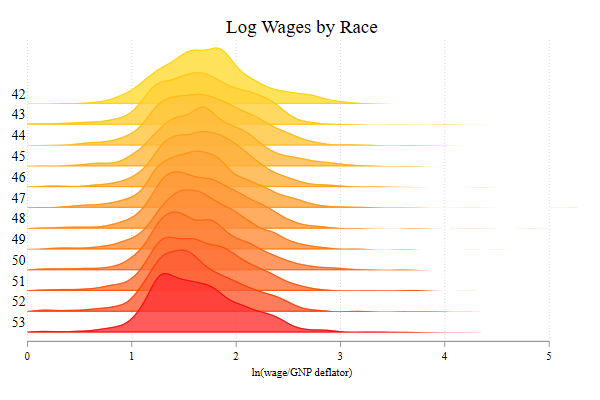 ] .pull-left[ Here I use a code that changes colors, using Year of birth for groups ```stata joyplot ln_wage if /// inrange(birth_yr,42,53) /// , byvar(birth_yr) bwadj(1) /// dadj(3) /// colorpalette(gold red, opacity(80)) /// title("Log Wages by Race") ``` ] ] ] ] --- ## Conclusions This was fun to code, and flex my programming muscles. More important, I wanted make an "easy" way to construct this figures. There is still some details to address. Specifically, allow for histograms, and time lines. I also want to add labels automatically. but everything step by step Comments? suggestions? Drop me a message! .center2[]