class: center, middle, inverse, title-slide # How to make Sankey plots ## The <code>ado</code> way ### Fernando Rios-Avila ---  <style> .center2 { display: block; margin-left: auto; margin-right: auto; width: 90%; } </style> --- # Disclaimer I should start by saying that what I will be presenting here is ***not*** the only way. Just they way I like to make this kind of plot, specially after some programming muscle flexing, and when I do not want to type the same text over and over again. That being said. A step by step guide on this plot can be found [here](https://medium.com/the-stata-guide/stata-graphs-sankey-diagram-ecddd112aca1). Learning how to do it step-by-step gives your more flexibility, but I hope you will find that using [`sankey_plot`](./sankey_files/sankey_plot.ado) is sufficiently flexible for most of your purposes. Of course, you should also download the helpfile [`sankey_plot`](./sankey_files/sankey_plot.sthlp) since it has more examples inside. Here I just cover basics Also, I just found out that there is a python application that was linked to Stata! You can find a link to application [here](https://www.mjcrowther.co.uk/software/sankey/) So let me start --- ## What are Sankey plots? According to Wikipedia, Sankey plots are : > A type of flow diagram in which the width of the arrows is proportional to the flow rate. > And are often used in the visualization of material flow analysis. <img src= https://www.theinformationlab.co.uk/wp-content/uploads/2018/03/Final-Dashboard.png width=50% class="center2" class="center2"> --- ## But what they, really? When you think about it, at its core, Sankey plots are nothing more then graphs of connected coordinates. You have the origin point `\((x0,y0)\)` and the destiny point `\((x1,y1)\)`, and you simply connect them with a line. Sounds Familiar? If that is the case, you could easily plot "ugly" Sankey plots using `Stata` command `pcspike`. The caveat: `pcspikes` draws straight lines, but Sankey uses nice smooth ones. .pull-left[ <img src="./sankey_files/sankey_1a.png" > ] .pull-right[ <img src="./sankey_files/sankey_1b.png" > ] --- ## But what they, really? There are smaller details that go with it, but, as long as you have a set of pair coordinates, you can easily connect them, and voila! **Sankey plot**. Getting the curved lines, however, may seem like a hassle. And even more if you are trying to keep track of all the elements connections, colors, etc. Thus, what I decided to do was write a small `ado` that makes creating this plots easy. In the next slides, I will show you how to use `sankey_plot` to make this type of plots, in Stata!. But first... 1. Get a copy of [`sankey_plot`](./sankey_files/sankey_plot.ado) and [`sankey_i`](./sankey_files/sankey_i.ado) in your computer. 2. Get a copy of [`sankey_plot.sthlp`](./sankey_files/sankey_plot.sthlp). 3. Get Asjad `schemepack` from SSC. Not necessary, but the white background is handy. 4. Get some of the example datasets: - [dogs_and_happiness.dta](./sankey_files/dogs_and_happiness.dta) - [immigration.dta](./sankey_files/immigration.dta) - [jobmarket.dta](./sankey_files/jobmarket.dta) `sankey_i` and `sankey_plot` are independent from each other, but it will help you understand the data structure, and how the command works. --- ## Simple Sankey plot Before we start with the heavy duty Sankey plot, Lets see how it actually works with a toy example. Say that you want to Sankey-sh connection between two points. (0,0)-(1,1). What you would do is: .panelset[ .panel[.panel-name[Code] ```Stata sankey_i 0 0 1 1 *-> x0 y0 x1 y1 ``` Notice with this command, you *feed* information for the two points you want to connect (x0,y0) to (x1,y1). The plot now will be almost identical to the one I produced before. The difference is that we can also play with other graph properties ] .panel[.panel-name[Plot] .center2[ 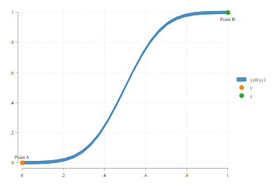 ] ] .panel[.panel-name[Code] ```Stata sankey_i 0 0 1 -3 0.2 0.5 *-> x0 y0 x1 y1 W0 w1 ``` In this example, I change the second coordinate, and add two other values. W0 (for width at point 1) and W1 for width at point 2. ] .panel[.panel-name[Plot2] .center[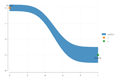] ] ] --- ## More Complex Sankey Plot Alright, the idea of using `sankey_i`, is for you to become familiar with the order of the data you will need to have to produce a Sankey plot. Namely, you will need data for each pair of *links* you want to make (say `x0, y0, x1, y1`), but also variables with information about the Widths. The basic syntax of the command, then will be: ```stata sankey_plot vx0 vy0 vx1 vy0, <--necessary [width0(varname) <-- Var with WIDTH point0 width1(varname) <-- Var with WIDTH point1 color(varname) <-- Var with color pstyle(varname) <-- Var with pstyle adjust extra <-- Adjusts Nodes possition Other options] <-- other code options ``` for more details on syntax, see the helpfile. --- ## More Complex Sankey Plot .panelset[ .panel[.panel-name[Input Data] Lets load some data: ```stata use immigration.dta list in 1/10, sep(0) +-------------------------------------------------------+ | from to value x0 x1 | |-------------------------------------------------------| 1. | Africa Africa 3.14247 1 2 | 2. | East Asia East Asia 1.631 1 2 | 3. | South Asia East Asia .525881 1 2 | 4. | South East Asia East Asia .145264 1 2 | 5. | Africa Europe 2.10788 1 2 | 6. | East Asia Europe .601265 1 2 | 7. | Europe Europe 2.40148 1 2 | 8. | Latin America Europe 1.76259 1 2 | 9. | North America Europe 1.21593 1 2 | 10. | Oceania Europe .17037 1 2 | |-------------------------------------------------------| ``` ] .panel[.panel-name[plot code] Create a simple sankey plot. the coordinates should be added in the same order as with `sankey_i`. In this case, y0 and y1 are "from" and "to" ```stata sankey_plot x0 from x1 to ``` ] .panel[.panel-name[plot] .center[ 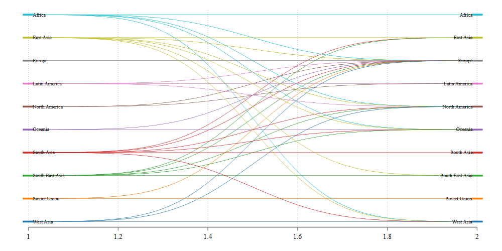] ] ] --- ## Beatify .panelset[ .panel[.panel-name[Goal] The first plot was not very nice looking, so here I will just make it look nicer, by adding some options: - How to change width's - Adjust graph to width's - Assign colors - change labels So lets do All of this at once! ] .panel[.panel-name[code] ```stata sankey_plot x0 from x1 to, /// width0(value) /// Adds Width info extra adjust /// Adjusts coordinates colorpalette(viridis, opacity(40)) /// adds color options(if installed) gap(0.1) noline /// adds spaces between nodes, and drops lines in flows xlabel(1 "Source" 2 "Destination", nogrid) // Modifies Xlabels ``` ] .panel[.panel-name[plot] .center[ 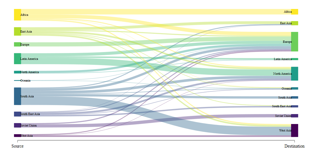] ] ] ] --- ## What about Multiple levels? .panelset[ .panel[.panel-name[Mlevels] The first example shows you how to do a Sankey plot across 2 levels. (source and destination). However, you could also try doing this for multiple levels. For this, lets use the jobmarket data ] .panel[.panel-name[Data] ```stata use jobmarket,clear . list in 1/10, sep(0) +----------------------------------------------------------------------------------+ | y0 y1 week0 week1 label0 label1 candid~s | |----------------------------------------------------------------------------------| 1. | 1 1 0 1 Jobs Applied to 32 Replies 15 15 | 2. | 1 2 0 1 Jobs Applied to 32 Rejections 5 5 | 3. | 1 3 0 1 Jobs Applied to 32 No Reply 12 12 | 4. | 1 1 1 2 Replies 15 Initial Interviews 9 9 | 5. | 1 2 1 2 Replies 15 Replied too late 6 6 | 6. | 1 1 2 3 Initial Interviews 9 Task Requested 4 4 | 7. | 1 2 2 3 Initial Interviews 9 No Task Required 1 1 | 8. | 1 3 2 3 Initial Interviews 9 Rejected by me 2 2 | 9. | 1 4 2 3 Initial Interviews 9 Rejections 2 2 | 10. | 1 1 3 4 Task Requested 4 Final Interview 5 4 | ``` ] .panel[.panel-name[Code] ```Stata sankey_plot week0 y0 week1 y1, width0(candidates) /// adds width adjust extra /// adjusts coordinates xlabel(0 " " 1 "Week 1" 2 "Week 2" 3 "Week 3" /// 4 "Week 4" 5 "Week 5" 6 "Week 6", nogrid) /// Modifies xlabels fillcolor(gs12%50) /// changes colors label0(label0) label1(label1) /// adds labels xsize(10) ysize(6) // and changes sizes ``` ] .panel[.panel-name[plot] .center2[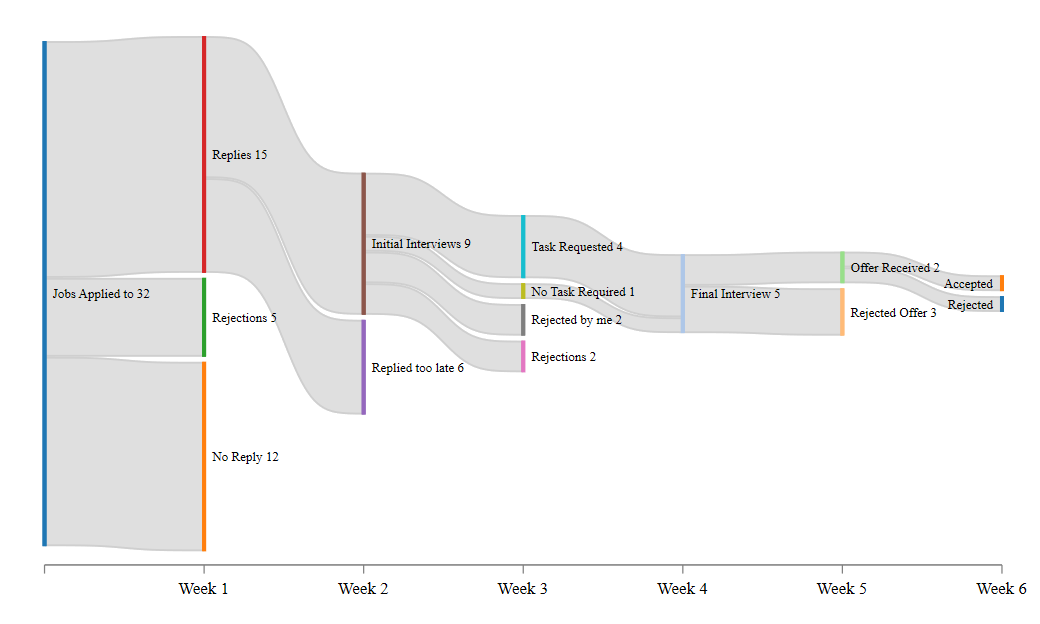]] ] --- ## Using Wide Data structure .panelset[ .panel[.panel-name[Wide Data] The other option for using `sankey_plot` is with wide data. In this case, levels are not defined by "x0 x1" but rather by the number of variables in your data. Consider the dog and happiness dataset ```stata use dogs_and_happiness, clear list +------------------------------------------+ | married pet happy freq | |------------------------------------------| 1. | Married:Yes Pet:Yes Happy:Yes 5 | 2. | Married:Yes Pet:Yes Happy:Yes 4 | 3. | Married:Yes Pet:No Happy:Yes 3 | 4. | Married:No Pet:Yes Happy:Yes 2 | 5. | Married:No Pet:No Happy:No 1 | +------------------------------------------+ ``` ] .panel[.panel-name[code] In this case, we have 3 levels (defined by married, pet, and happy). If you want to use this, you NEED to use "wide" option. You also need to provide a `width`.Here I also add other options to make the graph look pretty: ```Stata sankey_plot married pet happy , wide width(freq) /// Basic for wide data fillcolor(%50) /// Some color properties xlabel("",nogrid) gap(0.1) tight /// more of a gap, with tight groups title("The Secret to Happyness") /// Title and subtitle("Have Pets: Nora and Bruce!") /// subtitle note("Nora and Bruce belong to my wife and I") // and a note ``` ] .panel[.panel-name[plot] .center[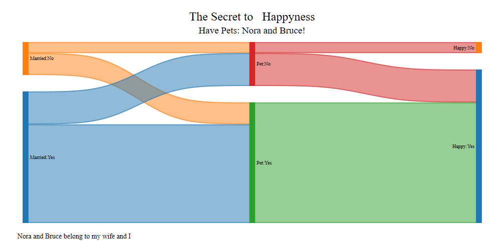] ] ] --- ## Conclusions This was fun to code, and flex my programming muscles. More important, I wanted make an "easy" way to construct these figures in `Stata`. Many details have been addressed, but always open to add other options. Comments? suggestions? Drop me a message! .center[]