graph size was (5.5in, 4in), is now (default, default).Palmer Penguins
A quick guide for visualization
Introduction
In this post, I will show some of the basics of data visualization using the Palmer Pinguins dataset. This dataset is available in R using the palmerpenguins package. And now there is also a copy of in using frause for Stata. The dataset contains data on 344 penguins collected from 3 islands in the Palmer Archipelago, Antarctica. The data was collected and made available by Dr. Kristen Gorman and the Palmer Station, Antarctica LTER, a member of the Long Term Ecological Research Network.
Setup
First, we need to install the frause package. This can be done using the ssc install command. We will also need some additional commands to change colors of shemes, and create and select custom colors. Please copy the following code to your do-file, or run it from your command line.
ssc install frause
ssc install color_style
net install colrspace, replace from(https://raw.githubusercontent.com/benjann/colrspace/master/)
net install palettes, replace from(https://raw.githubusercontent.com/benjann/palettes/master/)
net install grstyle, replace from(https://raw.githubusercontent.com/benjann/grstyle/master/)
Now, lets load the data, and set a cleaner scheme than the default. We will also set the default color scheme to tableau.
set scheme white2
color_style tableau
frause penguins, clear
Basic plots: Scatter plot
Lets start with a basic Scatter plot
twoway scatter flipper_length_mm body_mass_g, /// Creates a Scatter plot
    ytitle("Flipper length (mm)") ///             Sets the title for the y-axis
    xtitle("Body mass (g)") ///                   Sets the title for the x-axis
    legend(off) scale(1.1) ///                    Set legends off, and scale the plot by 1.1 (fonts)
xsize(9) ysize(6) // Finally, setting Size of the plot 
But we can also add some additional information to the plot. For example, we can color the points by the species of the penguin. We can change the markers, and finally, add a title and subtitle to the plot.
twoway (scatter body_mass_g flipper_length_mm if species == 1, msymbol(o) ) /// changes Symbol to a circle
    (scatter body_mass_g flipper_length_mm if species == 2, msymbol(t) ) /// changes Symbol to a triangle, etc
    (scatter body_mass_g flipper_length_mm if species == 3, msymbol(s) ) , /// Creates a Scatter plot by groups
    ytitle("Flipper length (mm)") ///             Sets the title for the y-axis
    xtitle("Body mass (g)") ///                   Sets the title for the x-axis
    legend(order(1 "Adelie" 2 "Chinstrap" 3 "Gentoo") ring(0)) ///  Adds text to the legend
    title("Penguin size, Palmer Station LTER", pos(11) span )  /// Adds a title to the plot
    subtitle("Flipper lengh and body mass by species", pos(11) span )  /// Adds a title to the plot
scale(1.1) xsize(9) ysize(6) // Scales the plot by 1.1 (fonts) 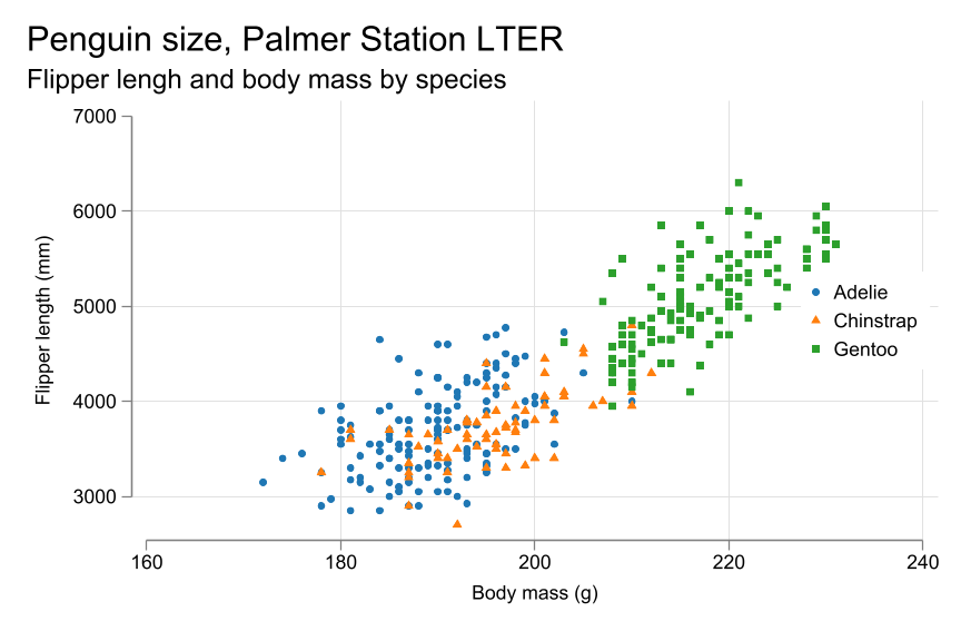
Of course, we could also add a regression line to the plot. On top of that, I will change the colors and size of the symbols. For this example, I will use different variables: Bill lenght and Flipper lenght. Changing the colors i will use color_style:
** This line changes the color of the scheme, setting the first n colors based
** on a list of colors, or a palette. See help colorpalette for more options
color_style darkorange purple LightSeaGreen

twoway (scatter bill_length_mm flipper_length_mm if species == 1, msymbol(o) ) ///
    (scatter bill_length_mm flipper_length_mm if species == 2, msymbol(t) ) ///
    (scatter bill_length_mm flipper_length_mm if species == 3, msymbol(s) ) ///
    (lfit bill_length_mm flipper_length_mm if species == 1, pstyle(p1) color(%60)) /// Creates fitted lines
    (lfit bill_length_mm flipper_length_mm if species == 2, pstyle(p2) color(%60)) /// Need to use pstyle to keep colors
    (lfit bill_length_mm flipper_length_mm if species == 3, pstyle(p3) color(%60)), /// consistent
    ytitle("Bill length (mm)") ///             Sets the title for the y-axis
    xtitle("Flipper lenght (mm)") ///                   Sets the title for the x-axis
    legend(order(1 "Adelie" 2 "Chinstrap" 3 "Gentoo") ring(0) pos(5)) ///  Adds text to the legend
    title("Flipper and Bill length", pos(11) span )  /// Adds a title to the plot
    subtitle("Dimensions by species", pos(11) span )  /// Adds a title to the plot
scale(1.1) xsize(9) ysize(6) // 
Basic plots: Histogram
histogram flipper_length_mm, lcolor(*.80) /// Creates a histogram, and
    ytitle("Frequency") ///             Sets the title for the y-axis
    xtitle("Flipper length (mm)") ///                   Sets the title for the x-axis
    title("Penguin Flipper length", pos(11) span )  /// Adds a title to the plot
    subtitle("Distribution of flipper length", pos(11) span )  /// Adds a title to the plot
    scale(1.1) xsize(9) ysize(6) //                                 Scales the plot by 1.1 (fonts)                                Scales the plot by 1.1 (fonts)
(bin=18, start=172, width=3.2777778)
Now by color. We will need to set width and binwidth to make the plot look better.
two (histogram flipper_length_mm if species==1, color(%50) lcolor(%0) ///
    frequency start(170) width(2) pstyle(p1)) ///
    (histogram flipper_length_mm if species==2, color(%50) lcolor(%0) ///
    frequency start(170) width(2) pstyle(p2)) ///
    (histogram flipper_length_mm if species==3, color(%50) lcolor(%0) ///
    frequency start(170) width(2) pstyle(p3)), ///
    ytitle("Frequency") ///                             Sets the title for the y-axis
    xtitle("Flipper length (mm)") ///                   Sets the title for the x-axis
    legend(order(1 "Adelie" 2 "Chinstrap" 3 "Gentoo")  ) ///  Adds text to the legend
    title("Penguin Flipper length", pos(11) span )  /// Adds a title to the plot
    subtitle("Distribution of flipper length", pos(11) span )  /// Adds a title to the plot
scale(1.1) xsize(9) ysize(6) // Scales the plot by 1.1 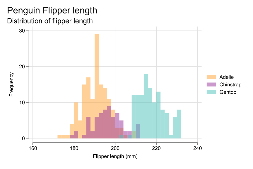
Basic plots: scatter plot by
color_style darkorange   LightSeaGreen

two (scatter body_mass_g flipper_length_mm if sex==1) ///
    (scatter body_mass_g flipper_length_mm if sex==2), ///
    by(species, col(3) note("")  ///
    title("Penguin Flipper and Body Mass", pos(11) span )  /// Adds a title to the plot
    subtitle("Dimensions for Male and Female", pos(11) span ))  /// Adds a title to the plot
    legend(order(1 "Female" 2 "Male") cols(2) ) ///
    ytitle("Body Mass (g)") ///             Sets the title for the y-axis
    xtitle("Flipper lenght (mm)") ///                   Sets the title for the x-axis
scale(1.1) xsize(9) ysize(6) // 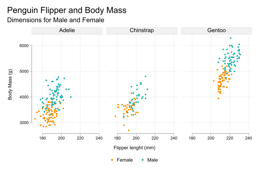
Conclusions
So this was just for fun, as I wanted to produce this, and use an extra fix of nbstata Enjoy